Beats Editorial
Reestablishing Beats as a culture driver in 2020. We set out to completely flip Beats’ website from hyper e-commerce to hybrid storytelling platform.
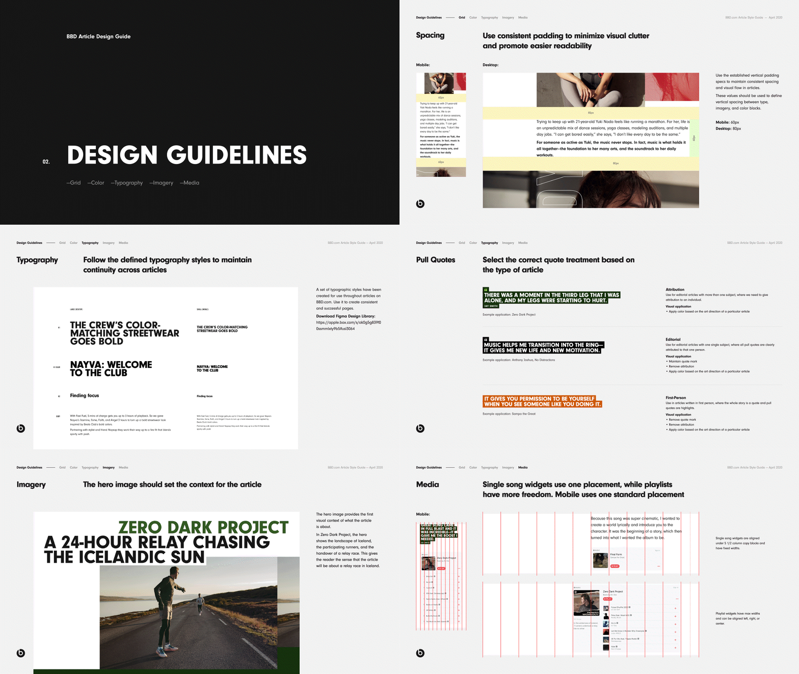
In my role as Digital Art Director, I collaborated with our agency partner to develop the architecture and design guidelines detailing grid, color, typography and imagery for Beats’ editorial platform.
Objective
The primary objective was to build brand affinity with Gen Z by reinforcing four key attributes within Beats’ ecosystem.
Copy Overview
Articles were meant to be inviting to read from start to finish, flowing naturally and effortlessly.
Break the copy into paragraphs no longer that ten lines, under five when possible.
No more than two paragraphs per module, one when possible.
Avoid repetition and modifiers that don’t add to the story.
Group related ideas together, creating clear transitions from on to the next.
Design Overview
Elements of the page including copy, imagery and embedded media are aligned on a 12 column grid. Use consistent padding to minimize visual clutter and promote easier readability.
Extract color from imagery to form the art direction of an article. Emphasize one core color throughout articles in different visual elements. Define secondary colors to be applied to accents and visual graphics.
Typographic style components were created in the Figma design library consisting of H1, H2 and Body. Use these to create consistent and successful articles.
Selected imagery should support the editorial topic. It should directly relate to the copy that is found directly above or below it and provide context to the story to promote an informative and visual experience.


